
Evolving Seeds component library
Role
Solo designer
Scope
Build and maintain Sprouts design system Seeds, support a multi product ecosystem, and enable for AI
Impact
Enable teams to build faster
Source
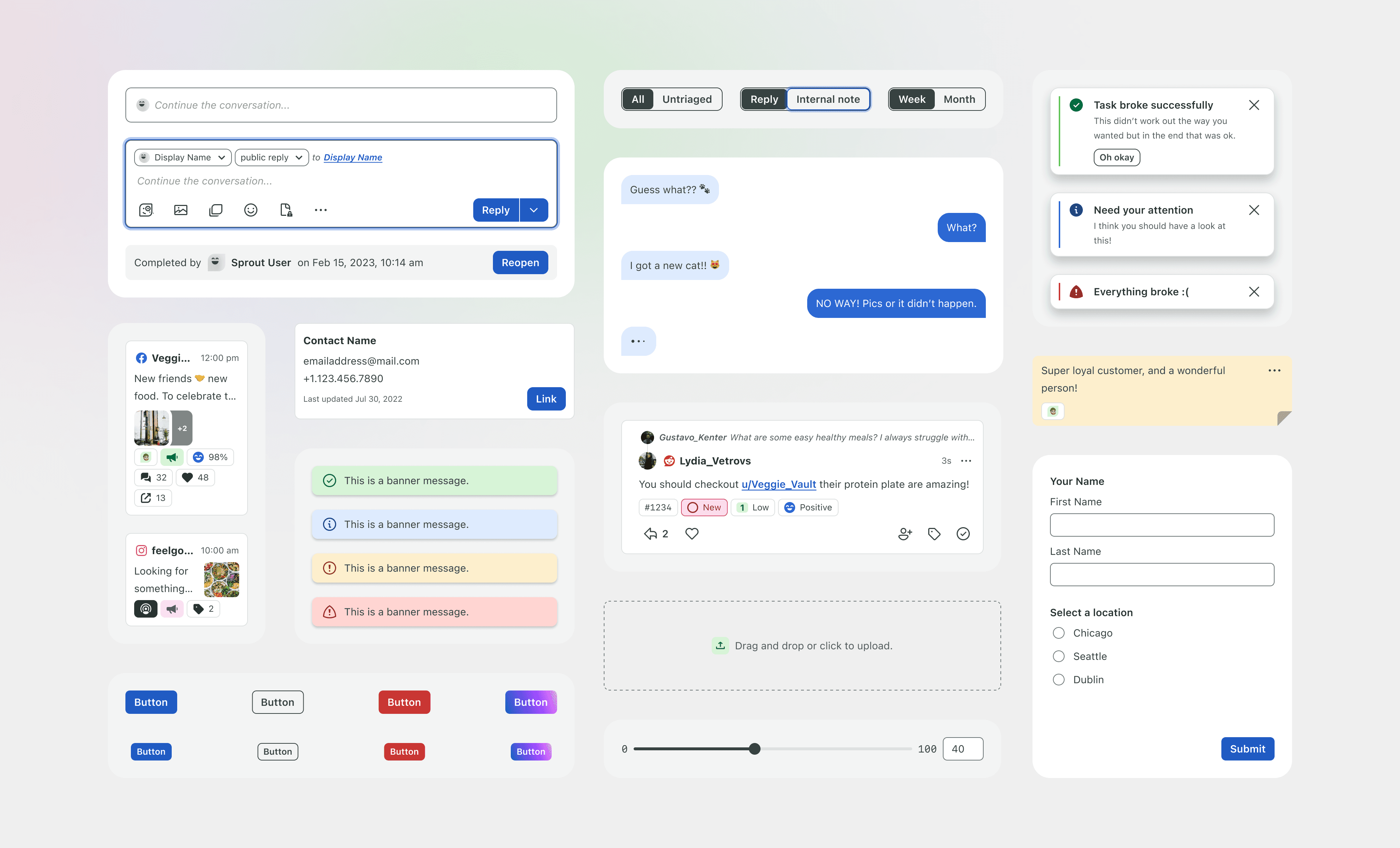

Overview
Before this library, components lived in an illustrator file that designers would duplicate at the start of a project. Teams recreated the same button, input, or nav pattern with slightly different styling, spacing, or states. Each copy drifting further from what was actually shipping in code. There was no single, trustworthy place a designer could go to know "this is the current, correct version of this component."
That meant:
Visual inconsistency across products in the suite
Wasted time rebuilding components that already existed elsewhere
A growing gap between what designers saw in Figma and what was actually in the codebase
No reliable way to verify a design matched its coded implementation

What I built
I first build a Sketch symbol library replacing the main Illustrator file and transitioned the team to Sketch as the primary design tool. Once Figma started to increase in adoption in the product design space I rebuilt the Sketch symbol library to a Figma component library and incorporating new Figma product features into the component library from auto layout, component variants, design variables, and slots. I evolved Sprout's Figma component library as the direct design-side representation of the coded component library, built on the semantic tokens from the Seeds foundations work.
Component parity with code
Every component in the library was structured to mirror its coded counterpart — same variants, states, and properties — so designers weren't guessing at what was technically possible.

Built on tokens
Components consumed the Seeds semantic tokens for color, spacing, and theming, so they'd automatically stay correct across light/dark mode and per-product branding.
Figma code connect
Every component was connected to its live code version via Code Connect, so designers and engineers could see the actual code snippet for a component directly from the Figma file closing the design-to-dev gap.

Ongoing maintenance and evolution
This wasn't a one-time build, it has spanned a number of tools from Sketch to Figma. I maintained the library over time. Adding new components and evolving existing ones as product teams surfaced new use cases the system didn't yet cover. Adopting new features when released by Figma into the library, auto layout, variables, variants, slots, etc.
Designer enablement
I worked directly with product designers to help them get the most out of the system, making sure they understood how to use the library correctly rather than just handing it off.

Previous project
Seeds foundations


Next project
Seeds icons